Brand and Messaging Evolution

Kids’ Food Basket

Opportunity

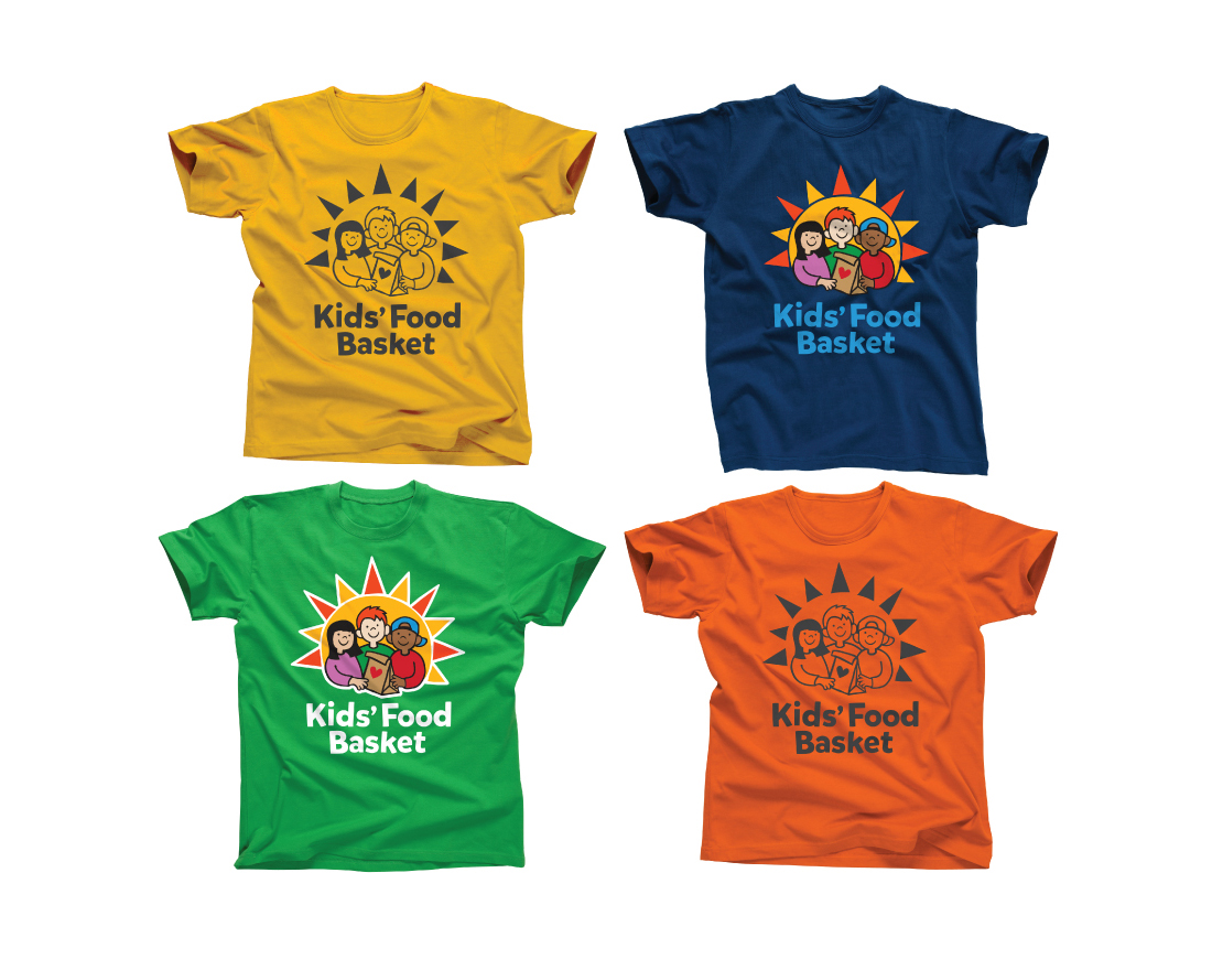
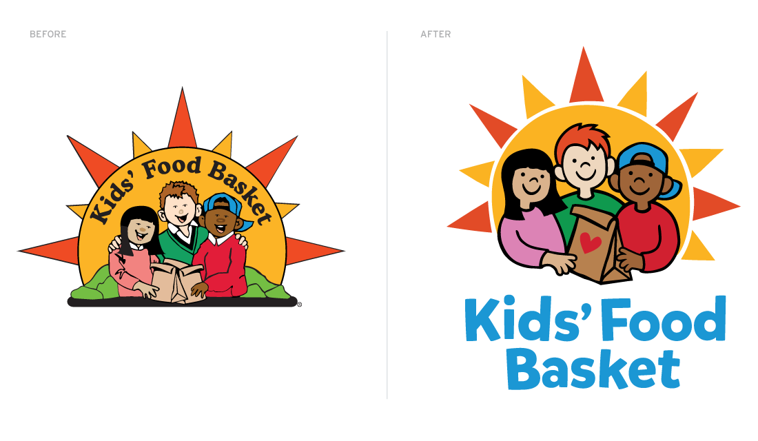
Kids’ Food Basket is an innovative nonprofit dedicated to attacking childhood hunger. This grassroots startup grew rapidly, and in just 11 years was providing a nutritious evening meal to nearly 7,000 young people living in low-income households, so none go to bed hungry. The organization, and its logo, grew to be loved throughout West Michigan. Recognizable, warm, energetic and friendly, the visual identity also posed challenges: Its complex design led to high print costs and made it difficult to produce well across multiple communications media—diminishing brand strength.

Results

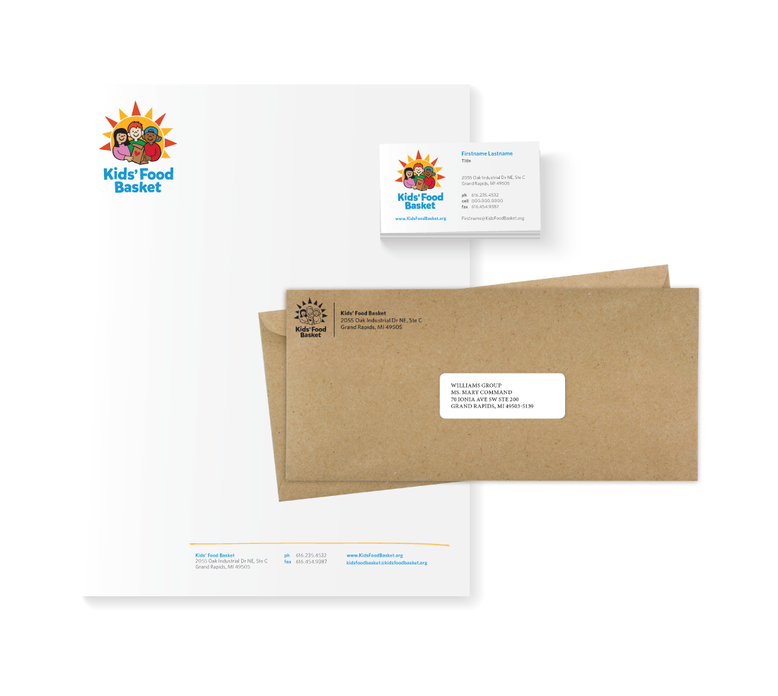
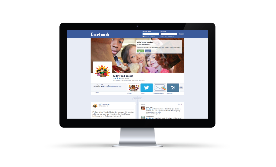
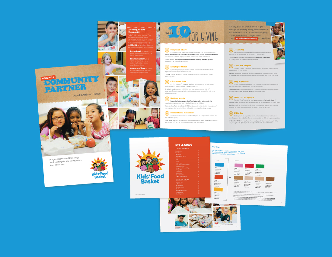
Wg has helped Kids’ Food Basket apply the updated identity to a suite of communications ranging from stationery and brochures to digital platforms. We also supplied an easy-to-use stylebook—complete with logo specifications, graphic guidelines and evolved messaging—that the Kids’ Food Basket team is using to create powerful, consistent communications on their own.

BRAND TYPOGRAPHY SAMPLES